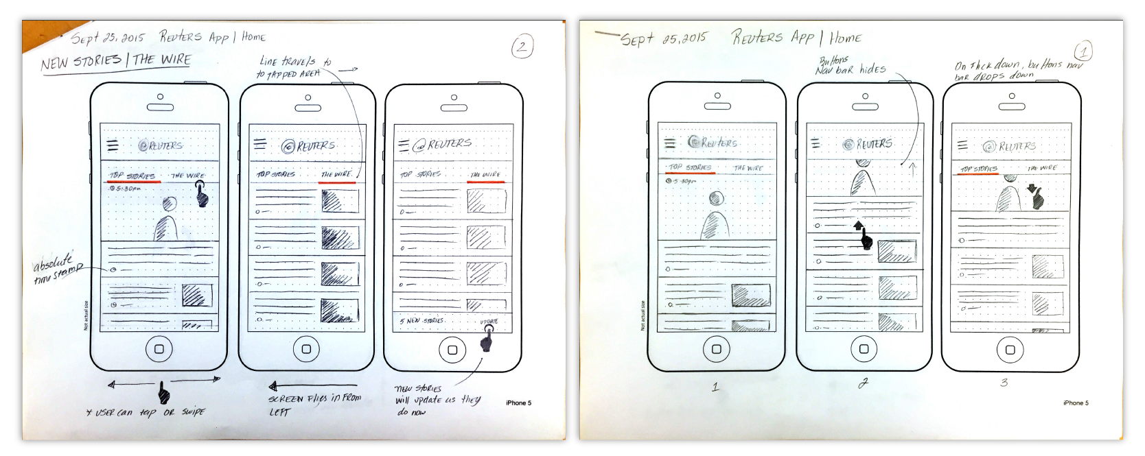
To updated the Reuters Android and iOS apps we re-structured the information architecture and modernized Ui. After researching what were the main areas readers were interested in , the front page was divided in the two: "Top news", which was curated news by the editorial team, and "The Wire" which displayed the news unfiltered as it was filed by journalists.
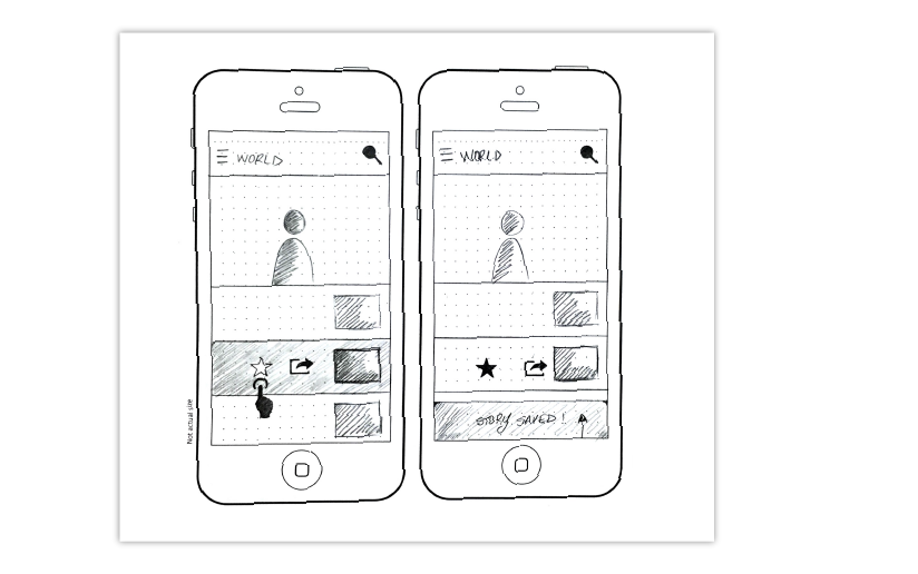
Research showed readers used the app while commuting. Sharing to social media was also becoming important for readers building a presence in the news social media networks. To meet this need, we introduced a long press shortcut that enabled quick access to save a story to read it later, or to share instantly to stay ahead.

App store feedback revealed that readers valued a dark theme - this option was included in version 2.6 of the app.

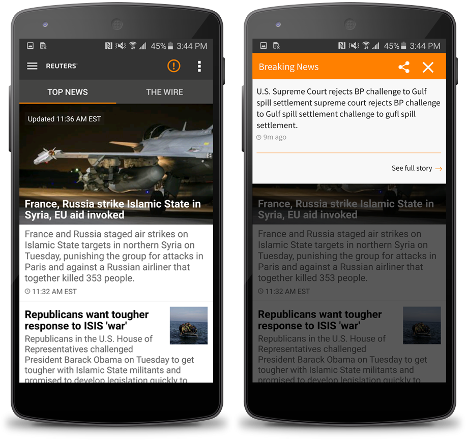
Breaking News Notifications
Trust is the most important feeling Reuters wants to evoke in readers. Breaking news notifications help build reliability and cater to the need for immediacy, accuracy, and relevancy. Sometimes, journalists only had a headline without all the story details. It was important for readers to follow these stories as they developed, therefore, the notifications included an option to view the full story (if available) or save it to receive updates as new details emerged.
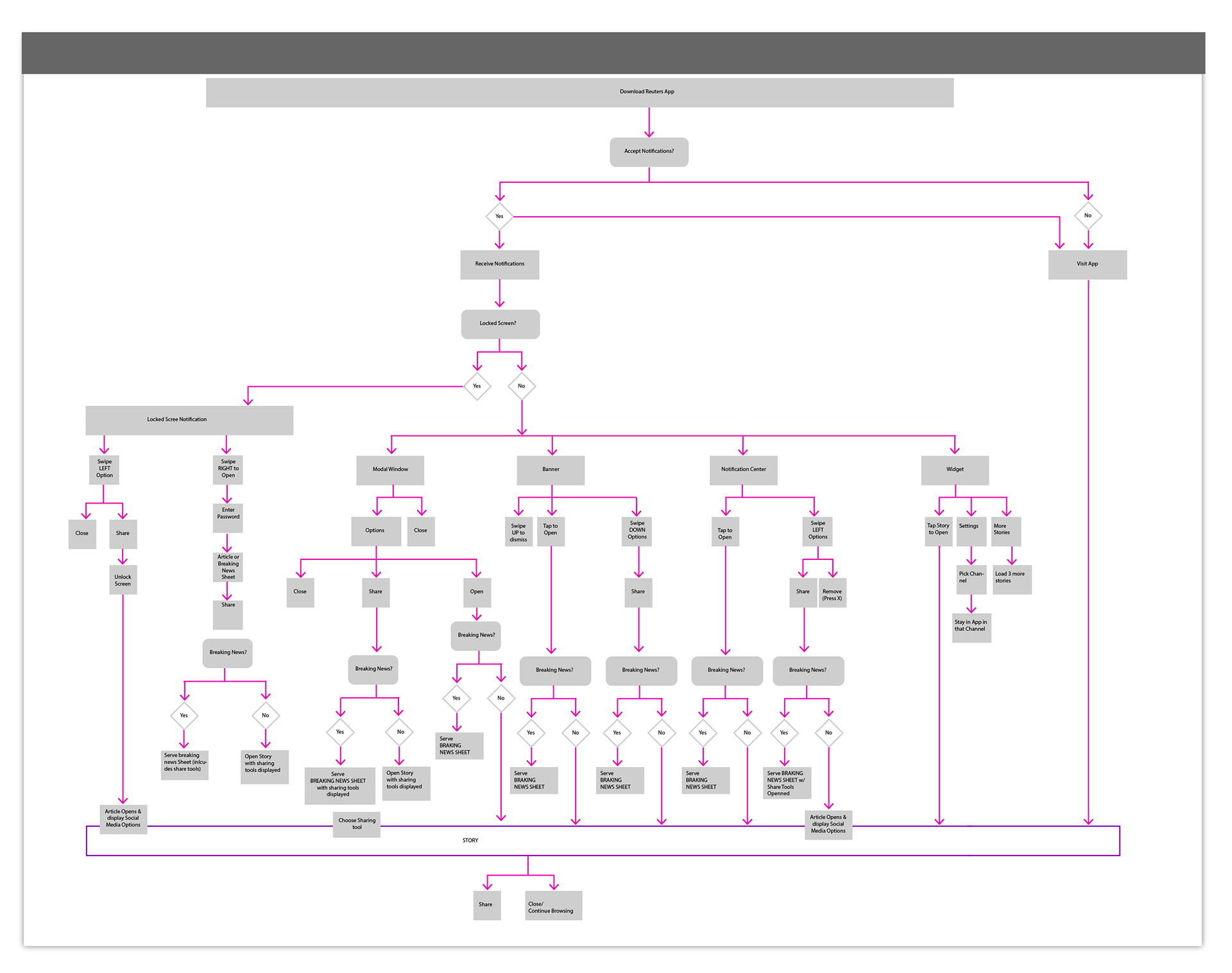
User flow chart for iOS breaking news notifications.
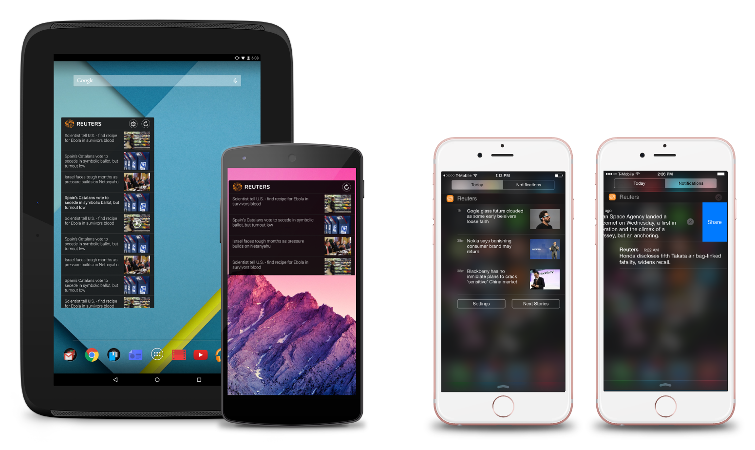
Android and iOS Widget
The home screen widget for Android and the Today Widget for iOS. Both allow users access to the Top 10 stories of the moment at a glance, without having to open the app.
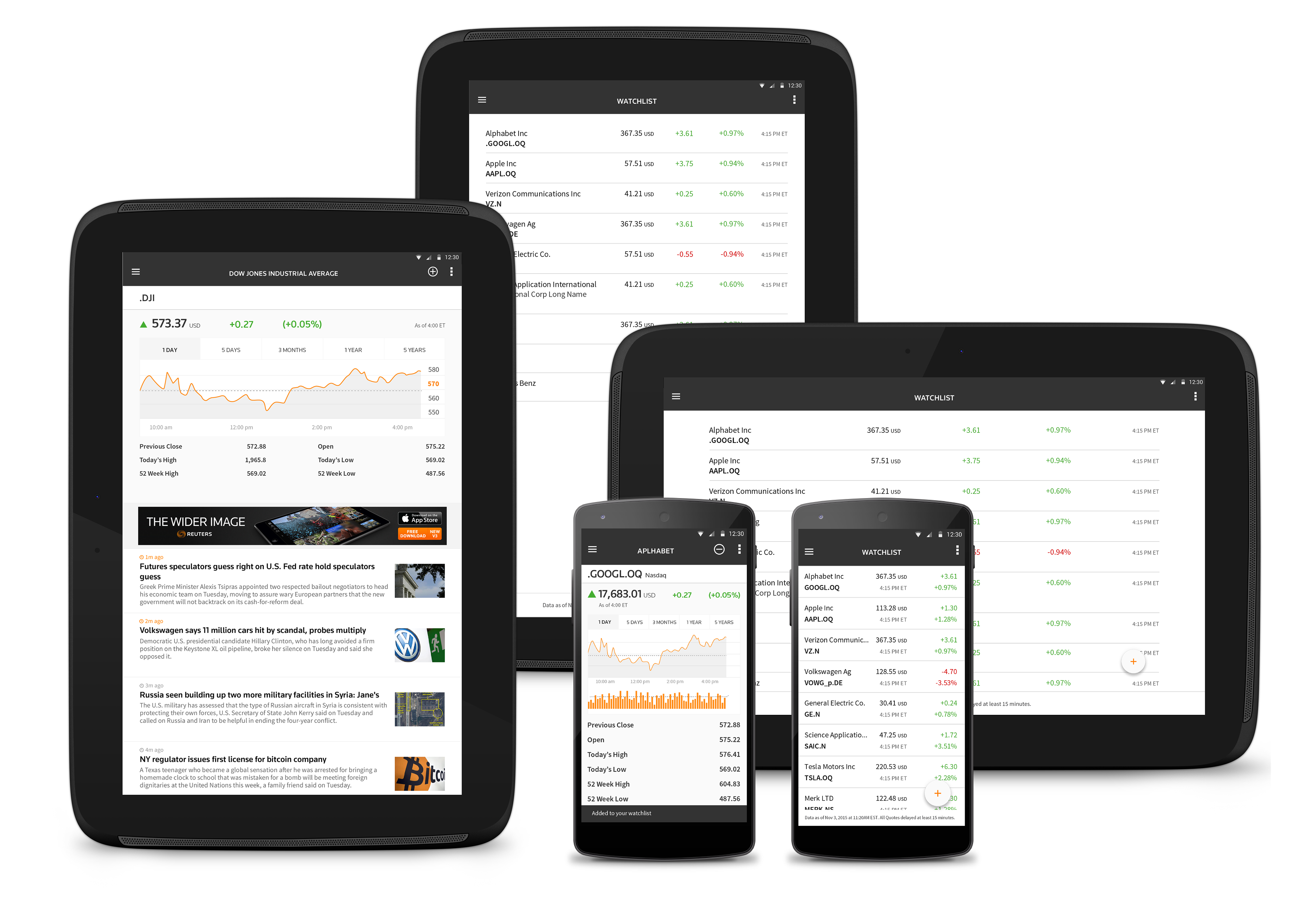
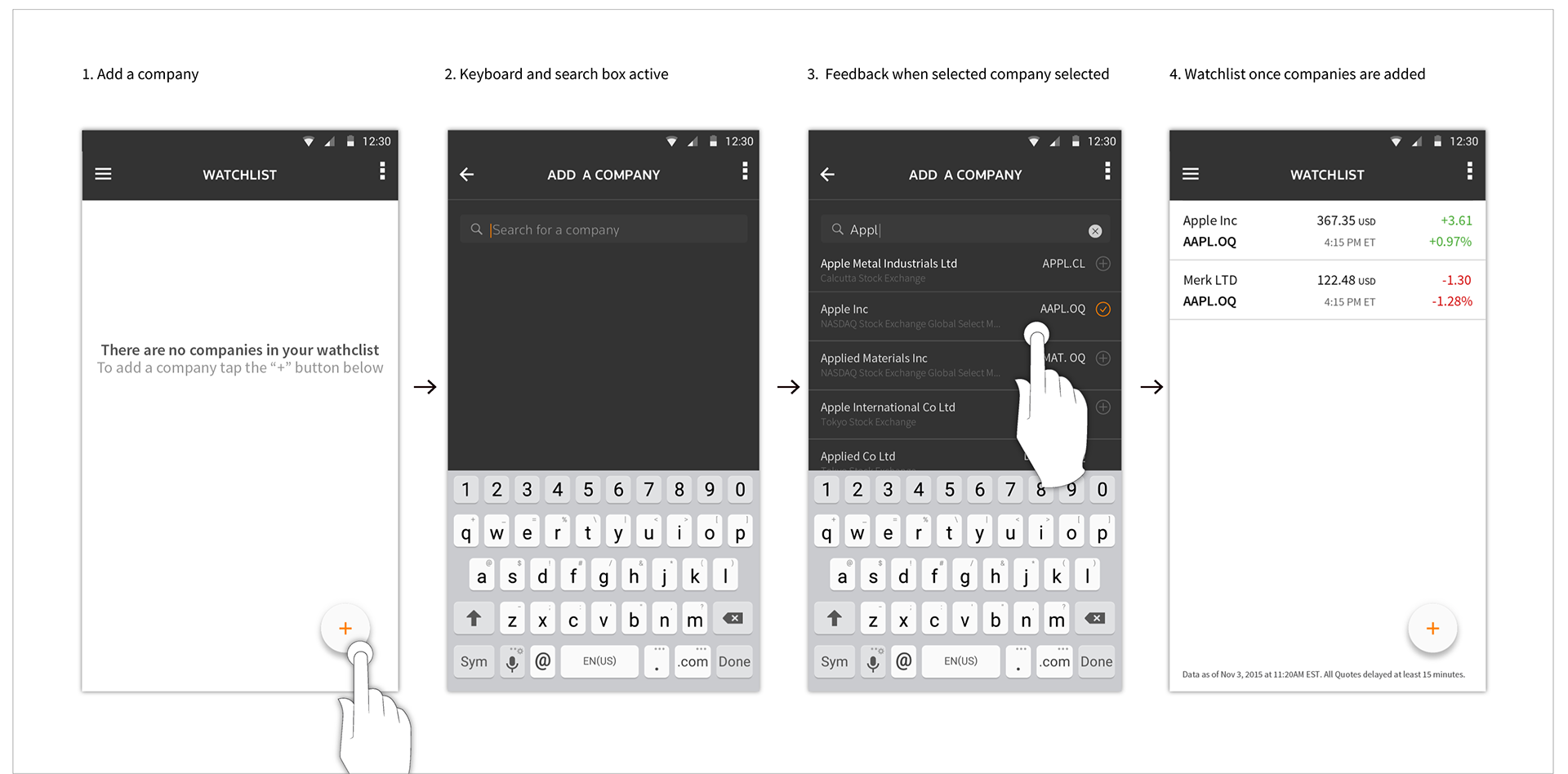
Market Data
Market data and global news are closely linked, as global events directly impact financial markets. For Reuters, it was crucial to present market data within the context of global news to provide a comprehensive view of how events influence financial trends.
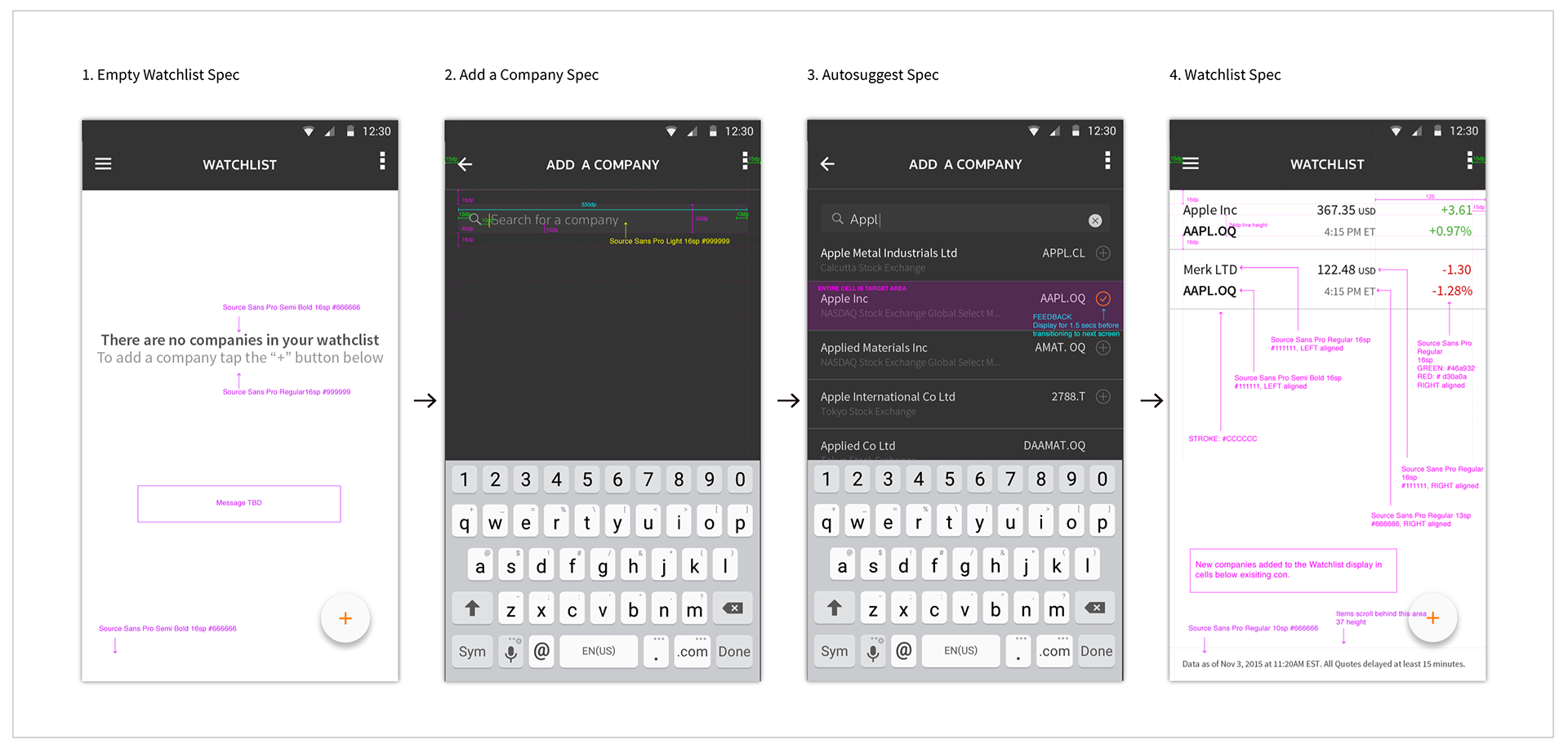
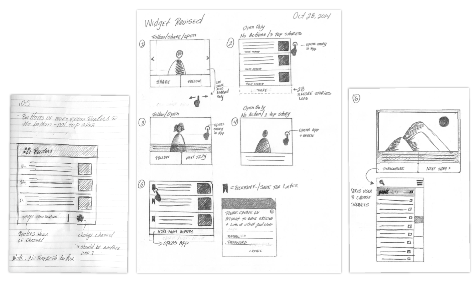
Old school specs :)